Bekind Live - Branding
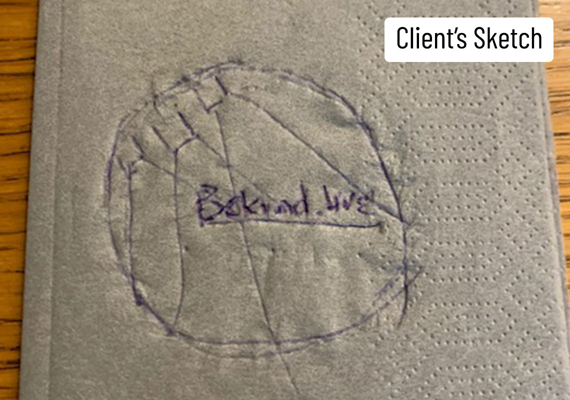
Bekind.Live are a charity which crowdsource from live events to facilitate their online community. Goals are determined based upon what their community choose as most relevant based upon immediate real world needs. As well as normal consultation prior to the design phase, the client was eager to stick as close as possible to a sketch they had done on a napkin! No problem...
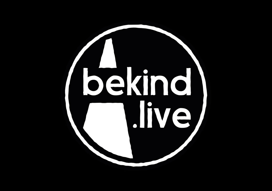
In this design, the name has been split on to two lines to fill the circle fully. A beam of light is positioned on the left side to visually separate the word ‘be’ from ‘kind’ to help with instant understanding of the term and also to fill in the large negative space.
Lowercase lettering has been used to promote an approachable, friendly feel and a roughened edge has been applied to the lettering and beyond to create a totally unified rendering throughout the logo. But the main reason for the roughening was to add a tactile, handwritten, realworld, human vibe. The mark looks like it’s either been stamped or woodcut printed and as such feels less mechanical and less cold and clinical.
All content © William Arbuckle
Follow us:
Client Comments
"The more I look at it - I’m happy with this!" - E.Bohms