Belief Press - Branding
Belief Press are a new online publishing business. They specialise in the psychology of belief - that is, from fundamental beliefs to mundane ones.
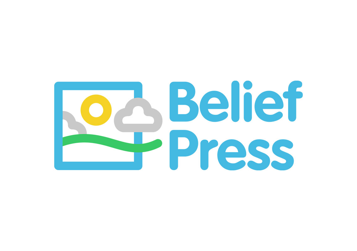
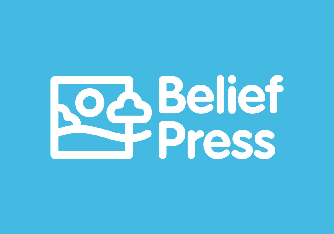
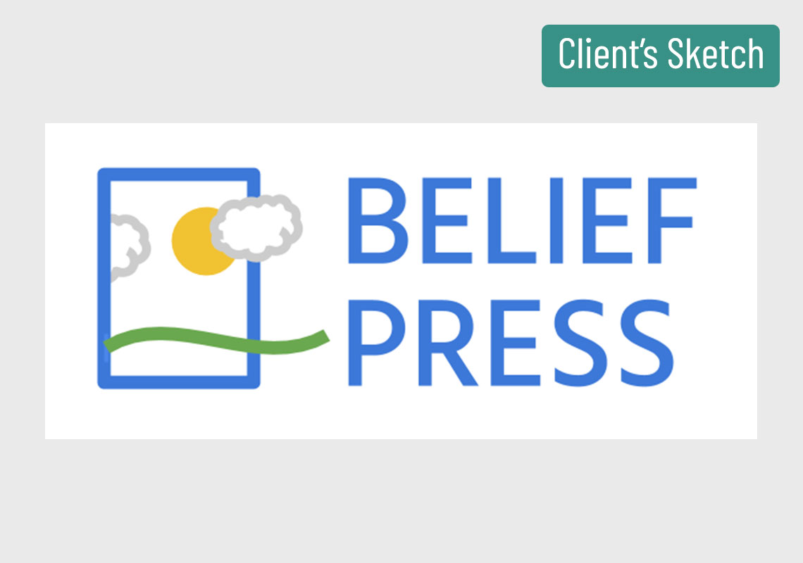
Edinburgh Logo Design took the original logo by the client and re-created it from a professional viewpoint. All the main aspects of the logo were addressed so that the clear underlying concept was kept intact. Changes were primarily centrered around the spacing between the elements, the colouring, the font and the unification of the mark as a whole.
Friendly Feel: The thickness, spacing and rounded corners of the shapes have been derived from the chosen font. Colours: Colours have mostly been brought through from the original design but a slightly more modern palette has been employed. Spacing: The spacing between elements is far more consistent in this version. Font: The rounded font provides an approachable feeling and the styling is continued on to the symbol to create a fully unified consistent mark. Outlines: All parts of the logo are now in an outlined style, rather than some being filled in with solid colour.
All content © William Arbuckle
Follow us:
Client Comments
"Thanks Will - it looks great. I'm glad that I chose you for this." - D. Farnell