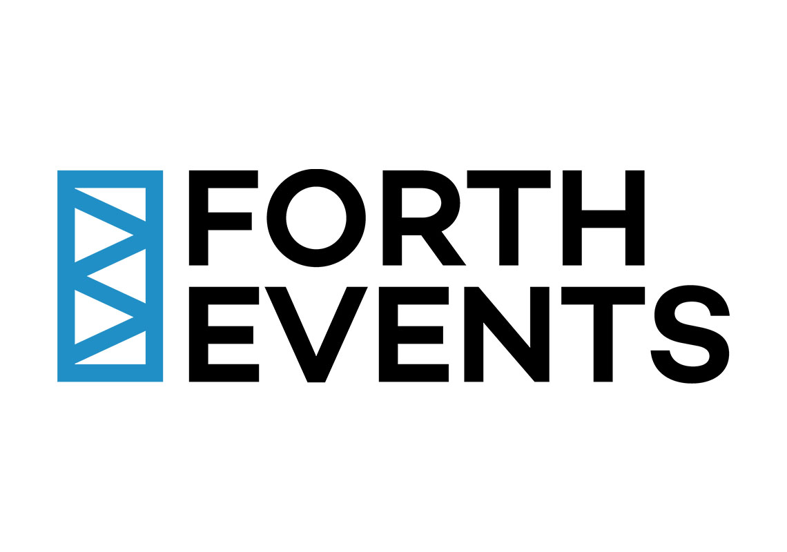
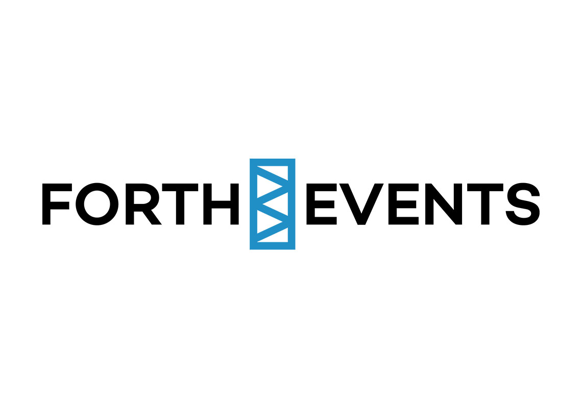
Forth Events - Branding
Forth Events, a company that supplies equipment for events across the Scottish central belt, needed a logo that reflected both professionalism and their core industry. They wanted something clean, straightforward, and memorable to represent their role as a key player in the event supply space.
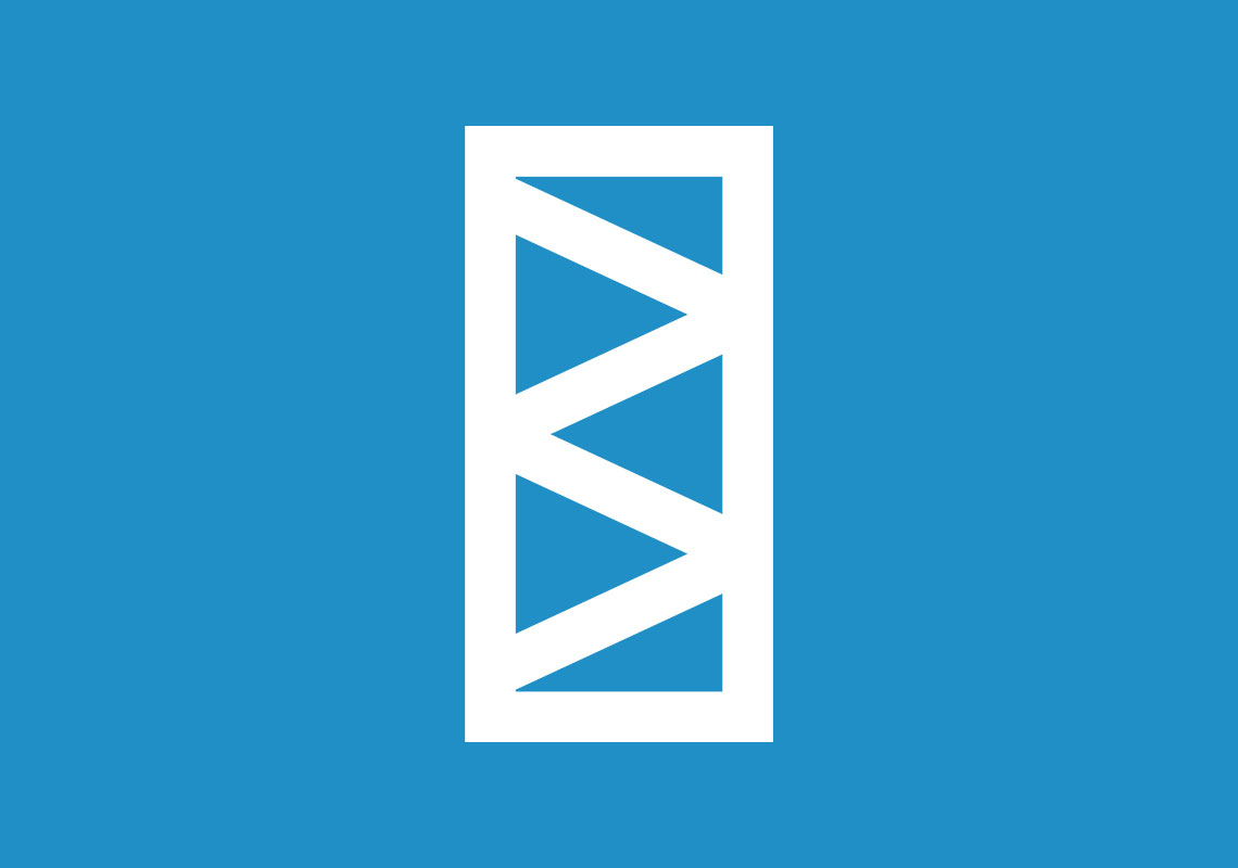
The resulting design features bold, uppercase lettering for "FORTH EVENTS" in a sleek, dark color, emphasizing strength and reliability. The simplicity of the type ensures that the brand name remains legible and impactful across all mediums. To complement the typography, a custom blue trussing logomark was created. This element nods to the structural backbone of event setups, symbolizing the company’s technical expertise and foundational role in bringing events to life.
The use of a minimal color palette—dark for stability and blue for trust—keeps the design versatile, ensuring it works in a variety of formats, from digital to print, while still maintaining a polished and modern appearance.
All content © William Arbuckle
Follow us:
Client Comments
"Thank you for sending this over. First thoughts are absolutely love all your concepts!" - S. Forrest