Hebmac - Branding
Hebmac is a platform that operates as a business directory and marketplace for all services across Scotland. They no longer felt that their current logo accurately reflected their business model and were looking for something far more suitable.
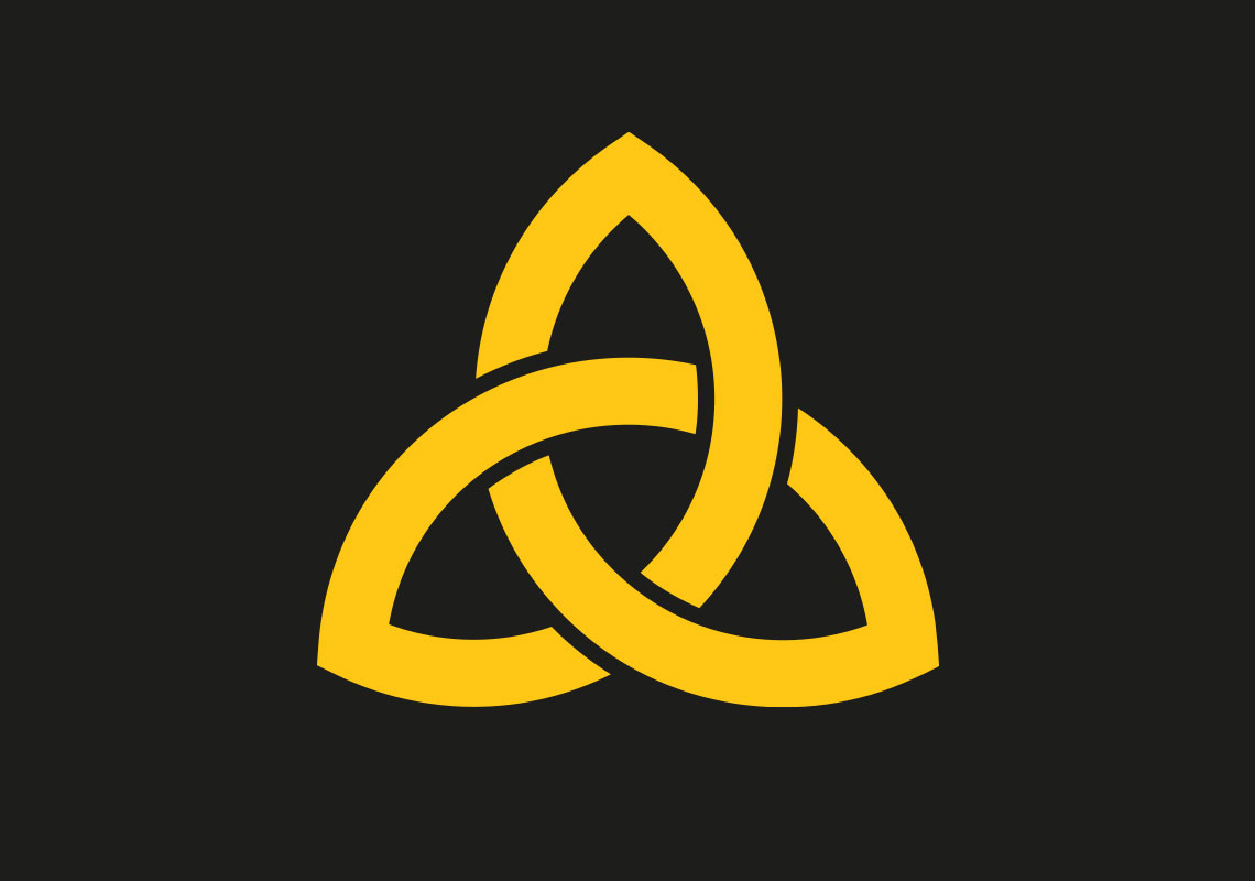
A lowercase sans-serif lettering was used to give a friendly approachable vibe - a specific font which looked strong enough to emit a feeling of reliability. A simple celtic knot symbol was also utilised to represent different points or services, linkage, connections. The infinite nature of the symbol feels ‘all encompassing’ and knots are considered secure and trustworthy - engaging with a clear Scot/Celtic connection.
All content © William Arbuckle
Follow us: