HEIGHT - Branding
HEIGHT, a company specializing in rope access and working at height, needed a logo that communicated their industry expertise while maintaining a sleek, modern appearance. They wanted the design to be bold and structured, reflecting the precision and safety required in their line of work.
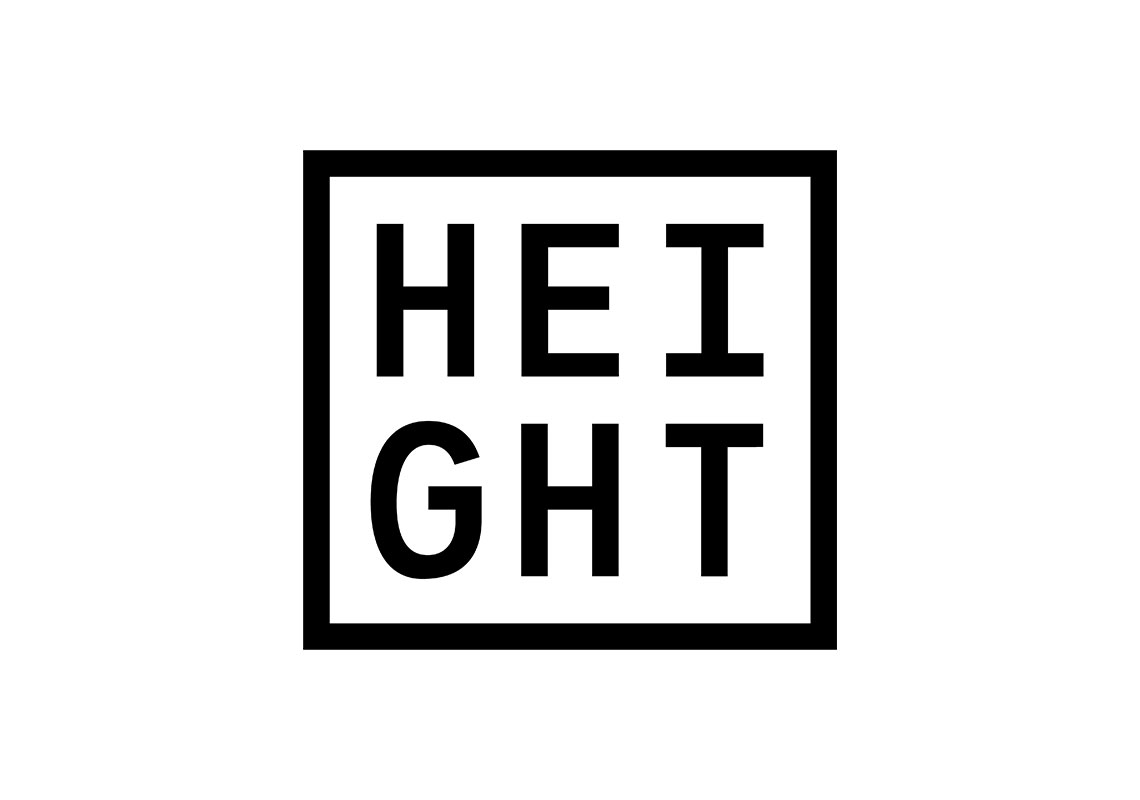
The logo is designed with a strong, grid-like layout, featuring two rows of three letters encased within a clean, square box. This structured arrangement symbolizes the company’s focus on stability and organization, key qualities in the height-access industry. The box further emphasizes containment and control, both essential elements when working in challenging, elevated environments.
The boldness of the lettering ensures visibility and strength, while the minimalist design keeps it versatile across various branding applications, from safety gear to vehicles and signage. The overall design captures both the technical and practical aspects of the company's work, allowing HEIGHT to present a professional and trustworthy image within the industry.
All content © William Arbuckle
Follow us:
Client Comments
"Yes that’s exactly what I’m looking for Will. Much appreciated." - M. Perfect