It Started in the North - Branding
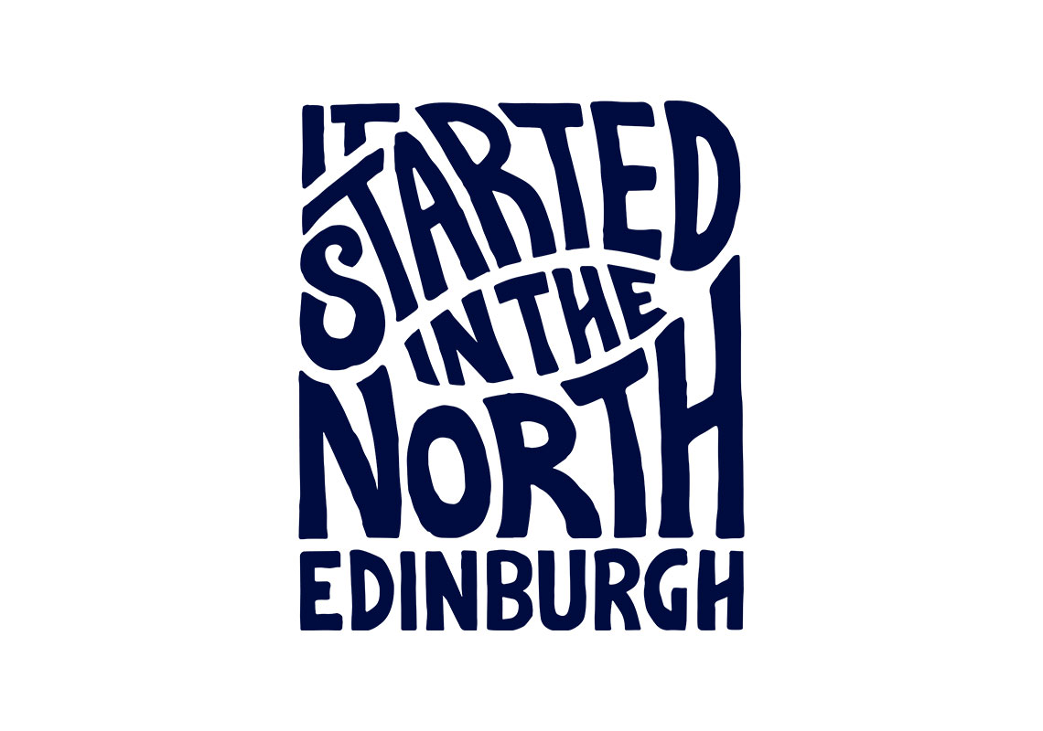
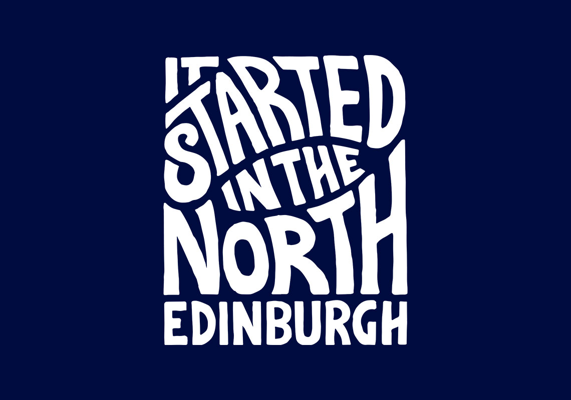
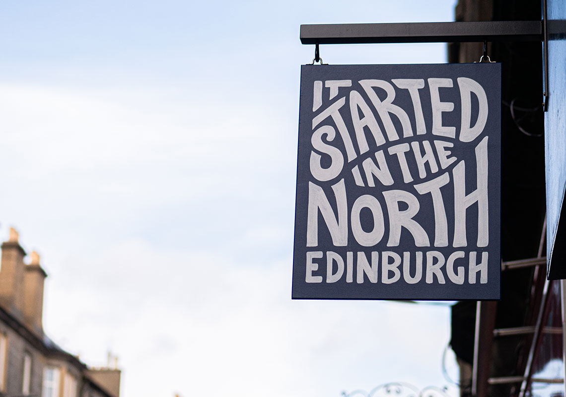
It Started in the North were looking to get a logo designed for their menswear retail store/coffee shop. It is a menswear retail store/coffee shop. The design was to be text only and the client provided a selection of logos of which to take inspiration from.
The same principles were studied from the reference logos and developed for this new mark. More modern lettering was used to stay away from a 60’s/70’s flared look which was present in the reference images.
For such a custom, intricate design, the decision of black-only (or navy) for the colouring is wise. Further inspiration was taken from the reference documents and the lettering has been rendered in a hand-drawn manner. This humanises the design and brings in a less clinical, more approachable tone of voice.
All content © William Arbuckle
Follow us:
Client Comments
"I’m pleased to say that we are all happy with the logos!" - B. Rowden