Jo Cooper Wellness - Branding
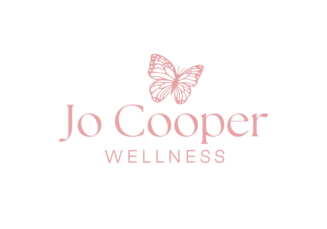
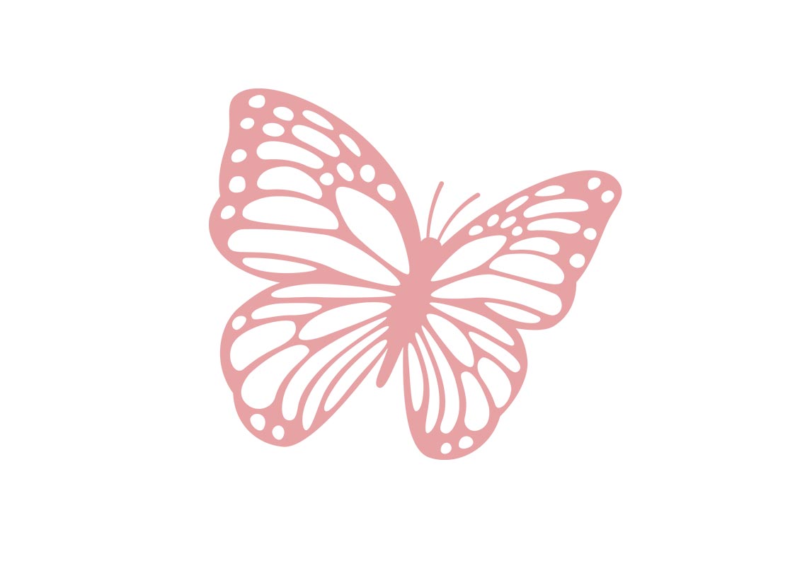
The design of the logo is a harmonious blend of modernity and nature-inspired grace. The choice of a modern serif font adds a touch of sophistication and timelessness, while the beautifully illustrated butterfly brings a sense of natural elegance and tranquility. The sleek lines of the serif font juxtaposed with the delicate curves of the butterfly create a visually striking composition that captures the essence of balance and harmony.
The butterfly, a universal symbol of transformation and renewal, serves as a fitting emblem for a wellness coach dedicated to guiding clients through their journey of personal growth and empowerment.
With its clean, refined aesthetic and evocative imagery, the logo embodies the ethos of Jo Cooper Wellness – a sanctuary for nurturing mind, body, and spirit.
All content © William Arbuckle
Follow us:
Client Comments
It is absolutely perfect! I am absolutely thrilled! - J. Cooper