KS Fitness - Branding
KS Fitness were currently in the process of creating a personal trainer business. They were at the stage where they needed a graphic designer to finalise the logo and help me with branding/identity. They had a company name in mind and a few logo ideas/examples to help get the ball rolling.
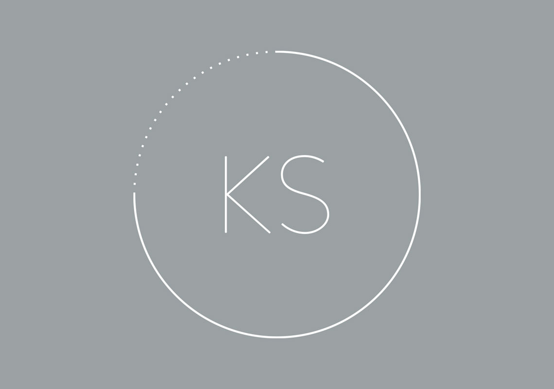
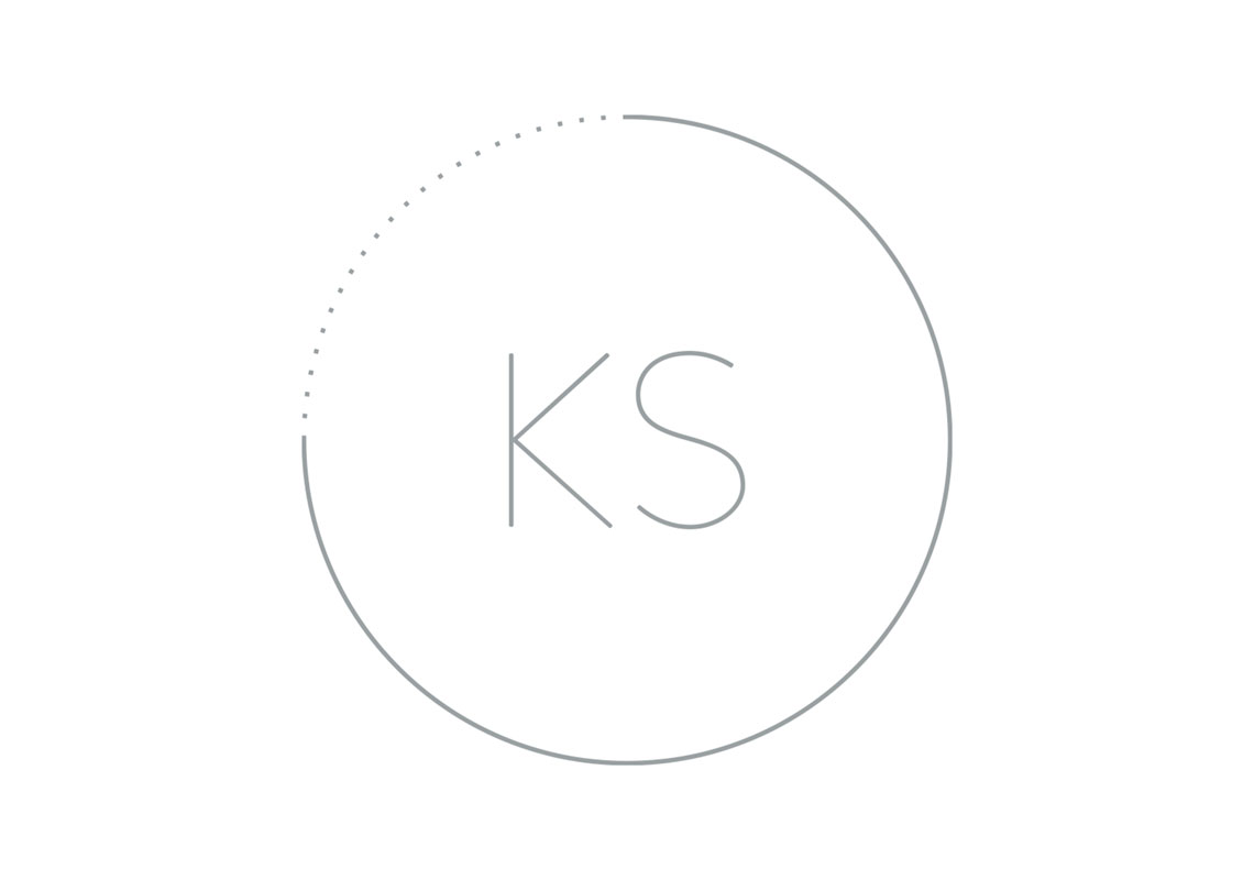
The first proposed design concept had a strong minimalistic, modern feel. The design uses lots of negative space and thin lines to acccomplish this. A circle contains the mark and at the same time brings in stopwatch symbolism in a really elegant manner.
All content © William Arbuckle
Follow us:
Client Comments
"Consistency across the board is definitely the right option. Looks really good!" - K. Smith