MJM Pressure Washing - Branding
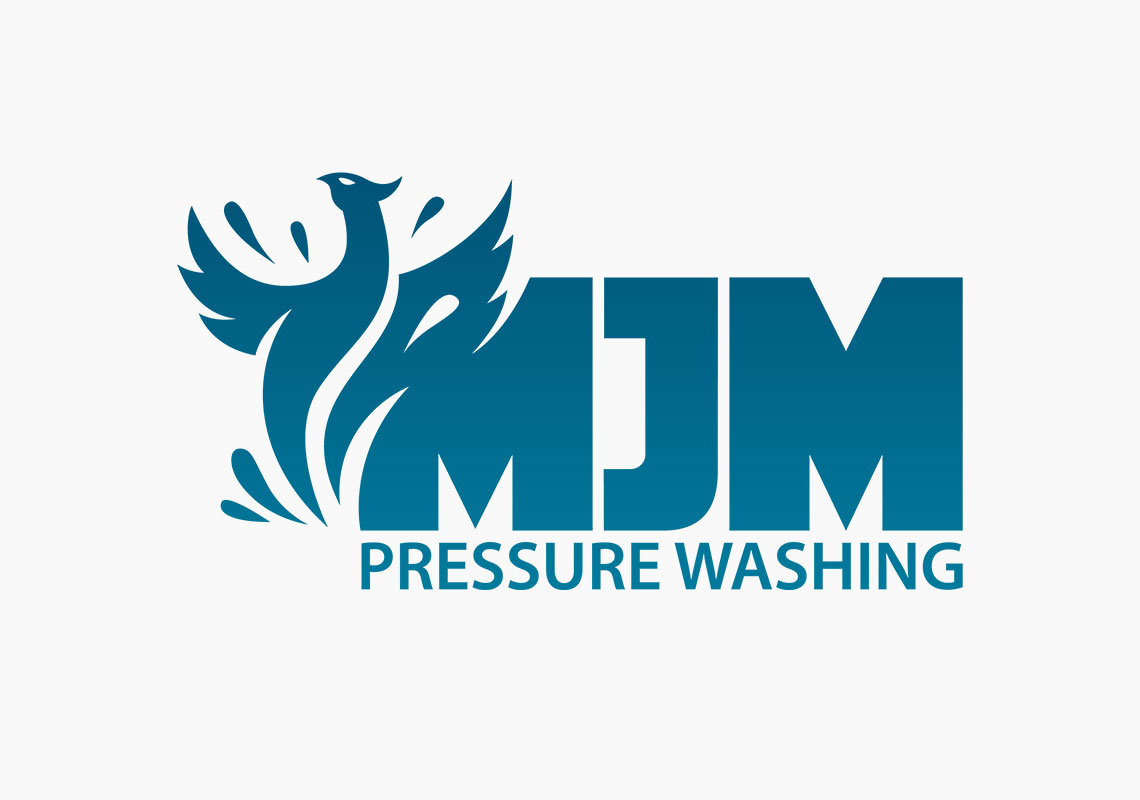
The logo design aspect of this branding project for MJM concentrates on the cohensiveness between the logo-mark and the logo-type (the phoenix and the text). One of the points raised when learning about MJM's key values was what the requested phoenix iconography represented, and how that could be shown in a company logo. Strength and integrity- a phoenix has both these qualities, but the naturally curved shapes of the bird, wings and water don't tend to lend themselves well to the concept of 'strength'.
In terms of text, this notion invokes imagery of big, solid, chunky, uppercase lettering. These 2 elements wouldn't sit well with each other and would create an awkward coupling. This is why the design went down the route of blending the bird into the first ‘M’. By doing this, a smooth transition was made between symbol and text.
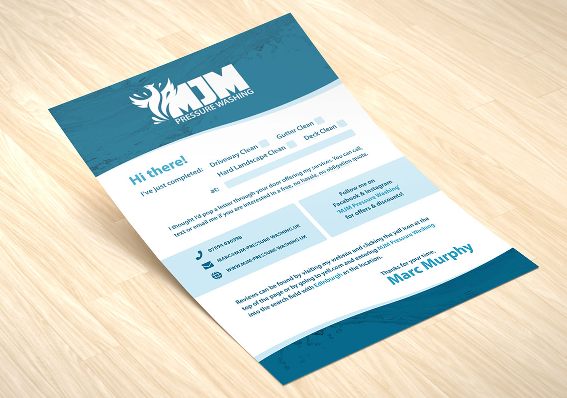
As part of the branding project an animated intro reveal sequence was produced and further marketing collateral was designed. The animated sequence is used for the lead-in for any video content the client wishes to publish to assure that the brand remains consistent on all medium be it digital or printed.
All content © William Arbuckle
Follow us:
Client Comments
"The whole concept of a new logo made me feel anxious and I'm happy to say your designs have alleviated those feelings." - M. Murphy