No Plan B Events - Branding
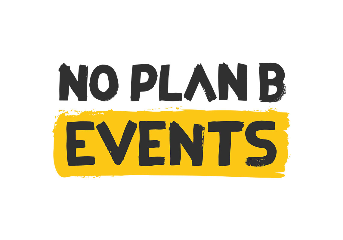
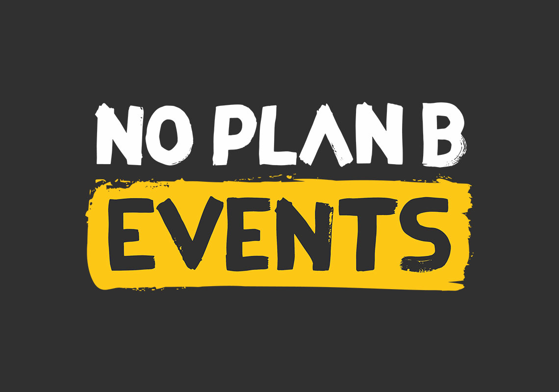
No Plan B Events were looking for a vibrant, eye catching logo design with a human touch to launch their start-up. A combination of hand drawn brush strokes and a punchy black/yellow colour palette were used to achieve this.
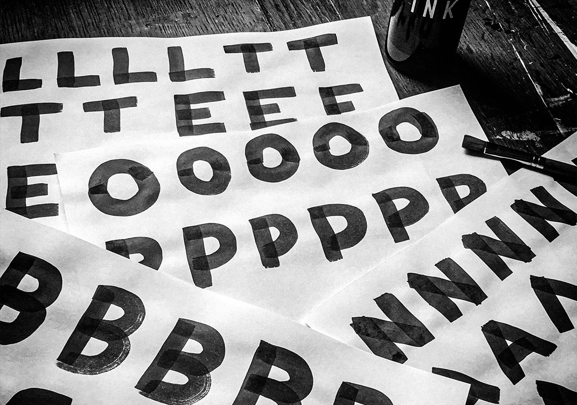
The main aim was to keep the feeling of a generic brush font logo but modify it to bring in fully custom elements for a completely unique design. Specifically, no two letters within the logo are alike, this is often a telltale sign of an amateurly designed logo when rendered in a ‘hand written’ style. The ‘A’ on the first line of text has had its crossbar removed to simplify, add a little more interest and balance with the ‘V’ in the 2nd line.
The distressed parts of the letters have all been carefully edited to keep the effect above a certain level of detail. Too much detail can be unjustified as it disappears and/or makes the shapes overall weight lighter when the logo is shown in a smaller size.

All content © William Arbuckle
Follow us:
Client Comments
"Brill thanks, this is definitely the route." - G. Turner