Rintoul - Branding
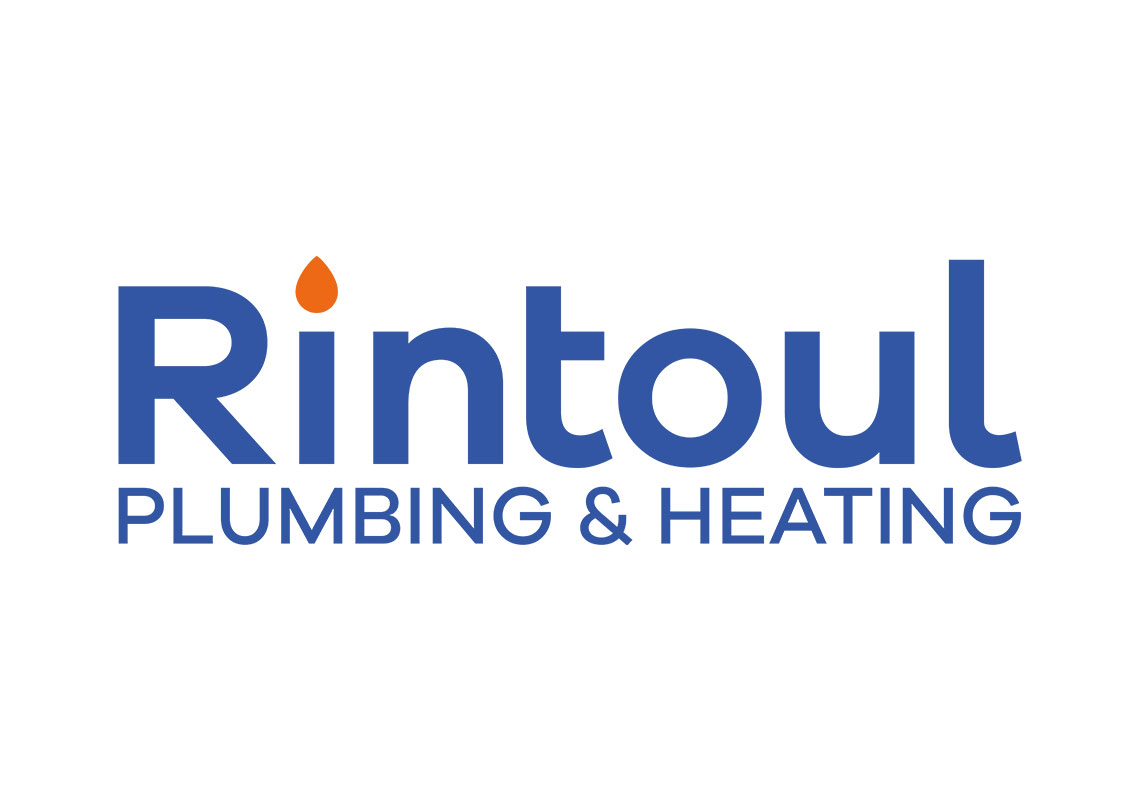
Rintoul plumbing were just starting out and needed a logo for all the usual small business needs.
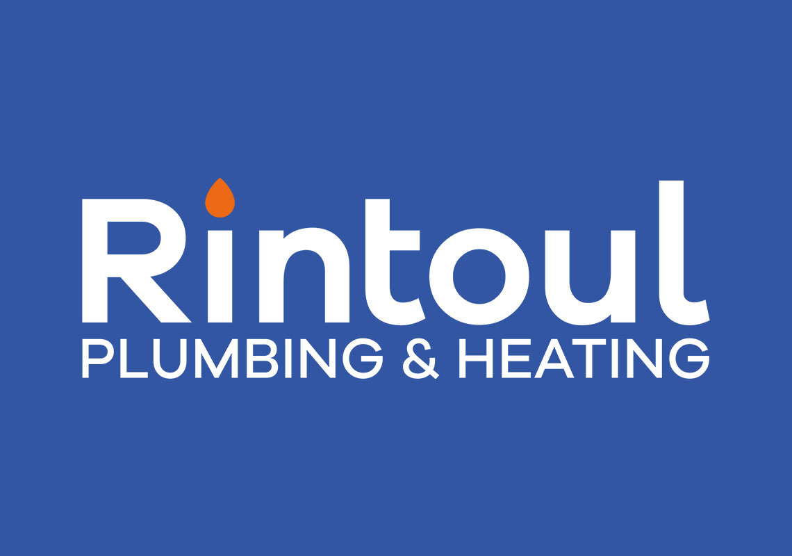
The design uses a rounded lowercase font choice and a subtle flame motif on top of the ‘i’ in Rintoul. The services text ‘PLUMBING & HEATING’ fits neatly below.
A medium blue was used to give not only a feeling of approachability but also of trustworthiness. A darker blue would give off more ‘security’ signals akin to a banking logo whilst a lighter blue would start to feel a little too flimsy and ‘pally’. The small orange flame motif is used sparingly to add a little note of interest to the logo as it might feel a little bland in just one colour tone. It gives an instant little focal point.
The font is thick enough so that it can be applied without any problems on various mediums like web, van sides or even embroidered clothing. Yet it’s not so thick that it feels overly ‘bold’ and in your face. The curves of the font also feel quite ‘pipe-like’ and as such, marry well with the actual nature of the business.
All content © William Arbuckle
Follow us: