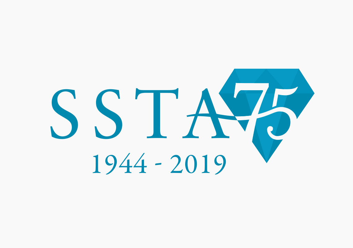
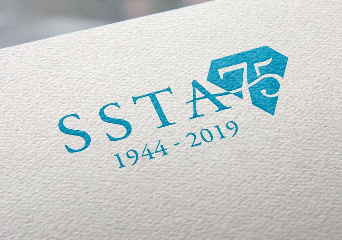
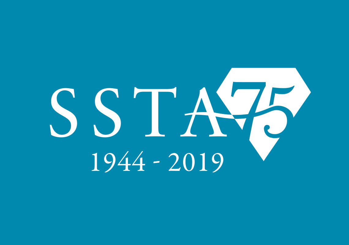
SSTA 75th Anniversary Logo - Redesign
Logos come in all sorts of shapes and sizes and likewise- so do the design briefs themselves. Edinburgh Logo Design was tasked with reimagining a competition winner's version of a special 75th anniversary version of the regular SSTA logo. Not only did we have to work within SSTA brand guidelines, a further layer of difficulty was introduced by having to stay true to another designer's work while still providing a professional, clean and concise design.
The main element that was taken forward from the reference logo to the design is the crossbar of the ‘A’ smoothly transitioning into the ‘7’. The swoosh was then taken further into the ‘5’ for even more cohesion in the design.
The diamond was placed behind the ‘75’ so that the design will work in 1 colour- which might be required for future applications of the logo, like letterheads and other printed material.
All content © William Arbuckle
Follow us:
Client Comments
"I really like the design, it also gives the flexibility of being able to print as 1 colour." - A. Brown